Choosing the Right Colors for Better Sleep and Relaxation

Your bedroom is more than just a place to sleep—it’s your personal sanctuary where you unwind, recharge, and prepare for a new day. One of the most powerful yet often overlooked aspects of bedroom design is color psychology for bedrooms. The colors surrounding you can influence your mood, stress levels, sleep quality, and even your overall well-being.
Whether you’re designing a new bedroom or planning a makeover, understanding how different colors affect emotions can help you create a space that perfectly suits your lifestyle. From calming blues to cozy earthy tones, every color tells a story and evokes a unique feeling.
In this guide, we’ll explore the principles of color psychology for bedrooms, explain what each color represents, and help you choose the perfect palette for a peaceful and stylish bedroom.
What Is Color Psychology?
Color psychology is the study of how colors influence human emotions, behaviors, and mental states. Interior designers frequently use these principles to create spaces that evoke specific feelings.
Since bedrooms are designed for rest and relaxation, selecting colors that encourage calmness and comfort is essential. The right shades can reduce anxiety, improve sleep, and make the room feel more spacious and inviting.
Why Color Psychology Matters in Bedroom Design
The bedroom should be one of the most relaxing spaces in your home. Bright or overly stimulating colors may increase energy, making it difficult to unwind after a busy day.
Using color psychology for bedrooms helps you:
- Promote better sleep
- Reduce stress and anxiety
- Create a cozy atmosphere
- Improve emotional well-being
- Make the room appear larger or more intimate
- Reflect your personality through design
Choosing the right colors creates harmony between aesthetics and functionality.
Best Bedroom Colors Based on Color Psychology
1. Blue – The Ultimate Relaxation Color
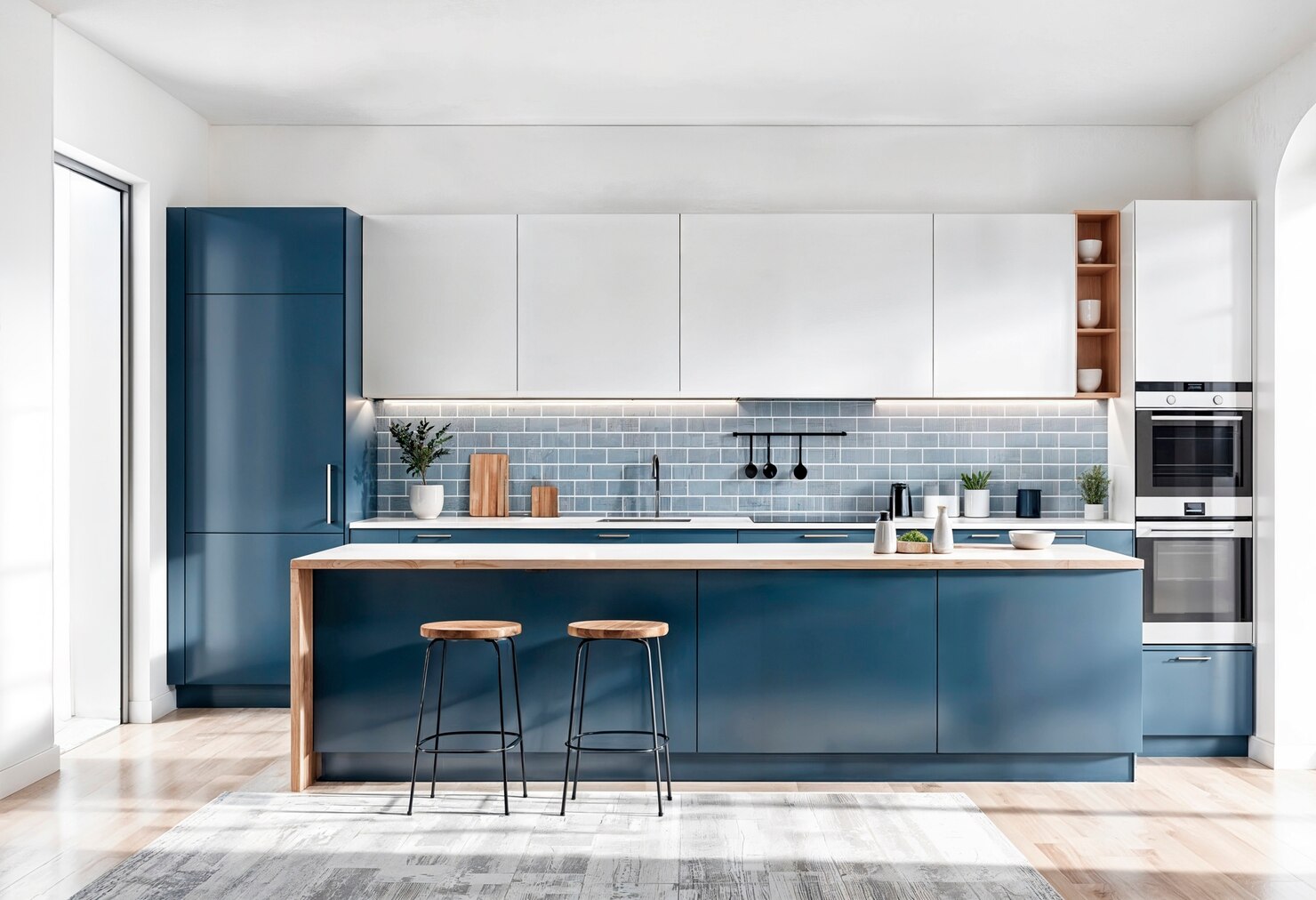
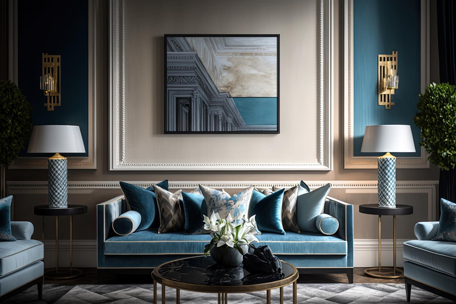
Blue is widely recognized as one of the most calming colors for bedrooms. It is associated with the sky and the ocean, creating feelings of peace, stability, and serenity.
Benefits:
- Lowers stress levels
- Encourages restful sleep
- Creates a cool and refreshing atmosphere
- Works well in both modern and traditional interiors
Popular shades include:
- Sky Blue
- Powder Blue
- Navy Blue
- Dusty Blue
Blue is an excellent choice for people with busy lifestyles who want their bedroom to feel like a retreat.
2. Green – Nature’s Comfort
Green symbolizes nature, balance, renewal, and harmony. It is gentle on the eyes and creates a fresh, peaceful environment.
Benefits:
- Promotes relaxation
- Reduces mental fatigue
- Brings the outdoors inside
- Complements wooden furniture beautifully
Popular shades:
- Sage Green
- Olive Green
- Mint Green
- Forest Green
Green is perfect for creating a bedroom that feels calm, refreshing, and naturally elegant.
3. Soft Beige and Neutral Colors
Neutral colors never go out of style. Beige, ivory, cream, taupe, and warm gray provide timeless elegance while maintaining a relaxing atmosphere.
Benefits:
- Creates warmth
- Makes small rooms appear larger
- Pairs easily with accent colors
- Offers a sophisticated appearance
Neutrals work particularly well in minimalist and contemporary bedroom designs.
4. Lavender and Soft Purple
Purple is often associated with creativity and luxury, but lighter shades like lavender create tranquility rather than drama.
Benefits:
- Encourages relaxation
- Adds elegance
- Creates a soft romantic ambiance
Lavender is ideal for homeowners seeking a luxurious yet peaceful bedroom environment.
5. Earthy Browns
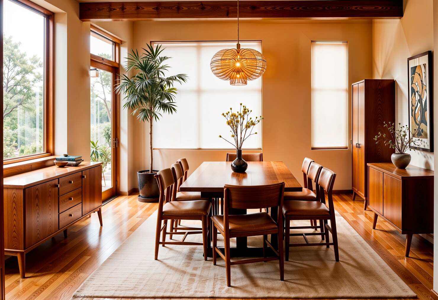
Brown represents stability, warmth, and security. Earth-inspired shades help make a bedroom feel grounded and welcoming.
Popular choices include:
- Sand
- Camel
- Chocolate Brown
- Walnut
Pair brown with cream walls or soft white bedding for a balanced look.
6. Warm White
White symbolizes cleanliness and simplicity. While pure white can sometimes feel clinical, warmer shades create a bright and calming atmosphere.
Benefits:
- Maximizes natural light
- Makes rooms appear spacious
- Creates a timeless aesthetic
- Complements any décor style
Warm whites pair beautifully with wood textures, linen fabrics, and indoor plants.
Colors to Use Carefully
Although personal preferences vary, certain colors may be too stimulating for a bedroom when used excessively.
Bright Red
Red increases energy levels and excitement. While it can add warmth as an accent, using it on every wall may interfere with relaxation.
Vibrant Orange
Orange inspires enthusiasm and creativity but can feel overly energetic in a sleeping space.
Bright Yellow
Yellow reflects happiness and optimism, but overly saturated shades may become visually overwhelming.
Dark Black
Black creates drama and sophistication, but excessive use can make bedrooms feel smaller and darker. Balance it with lighter furniture and soft lighting.
Choosing Colors Based on Bedroom Size
Small Bedrooms
Lighter shades make compact spaces feel open.
Recommended colors:
- Warm White
- Light Gray
- Soft Blue
- Pale Green
- Beige
Large Bedrooms
Larger rooms can comfortably accommodate richer tones.
Recommended colors:
- Navy Blue
- Olive Green
- Deep Taupe
- Charcoal Gray
- Warm Brown
Combining Colors for Better Balance
Instead of using only one color, combine complementary shades for a harmonious look.
Examples include:
- Sage Green + White
- Beige + Walnut Brown
- Dusty Blue + Light Gray
- Lavender + Cream
- Olive Green + Natural Wood
Layering colors with textiles, curtains, rugs, cushions, and artwork adds visual interest without overwhelming the room.
Lighting and Color Psychology
Lighting significantly affects how colors appear.
Natural daylight reveals true colors, while warm artificial lighting enhances cozy tones such as beige, cream, and earthy browns. Cool lighting emphasizes blues and grays.
Before committing to a paint color, test samples during different times of the day to see how they interact with your room’s lighting.
Matching Colors with Bedroom Styles
Different interior styles pair naturally with specific color palettes:
- Modern: White, gray, charcoal, navy
- Minimalist: Beige, ivory, warm white
- Scandinavian: White, soft gray, light wood tones
- Luxury: Emerald green, navy, taupe
- Bohemian: Olive green, terracotta, cream
- Classic: Soft blue, beige, walnut brown
Choosing colors that complement your furniture and décor creates a cohesive and inviting space.
Tips for Applying Color Psychology in Bedrooms
To make the most of color psychology for bedrooms, consider these practical tips:
- Choose calming colors for walls.
- Introduce bold colors through accessories rather than large surfaces.
- Coordinate bedding, curtains, and rugs with your wall color.
- Use natural materials like wood and cotton to enhance warmth.
- Add plants to complement earthy color palettes.
- Maintain a balanced contrast between walls and furniture.
Final Thoughts
Understanding color psychology for bedrooms allows you to create a space that supports both physical relaxation and emotional well-being. The right colors can improve sleep, reduce stress, and transform your bedroom into a peaceful sanctuary.
Soft blues, gentle greens, warm neutrals, earthy browns, and elegant lavenders consistently rank among the best choices for bedroom interiors because they promote comfort and tranquility. By combining these colors thoughtfully with suitable lighting, furniture, and décor, you can design a bedroom that is not only beautiful but also restorative.