Colour choices to enhance space
When it comes to interior design, few elements are as powerful and transformative as colour. The right palette can make a small room feel expansive, a dark corner feel bright, and an ordinary space feel stylish and inviting. Understanding Colour choices to enhance space is essential whether you’re designing a home, office, or retail environment.
In this blog, we’ll explore how thoughtful colour selection can visually expand and elevate any space, along with practical tips to help you achieve the desired effect.
Understanding the Impact of Colour on Space
Colour has a psychological and visual effect on how we perceive a room. Lighter shades tend to open up a space, making it feel airy and larger, while darker tones can create a cozy, intimate atmosphere. By mastering Colour choices to enhance space, you can control how a room feels without physically altering its dimensions.
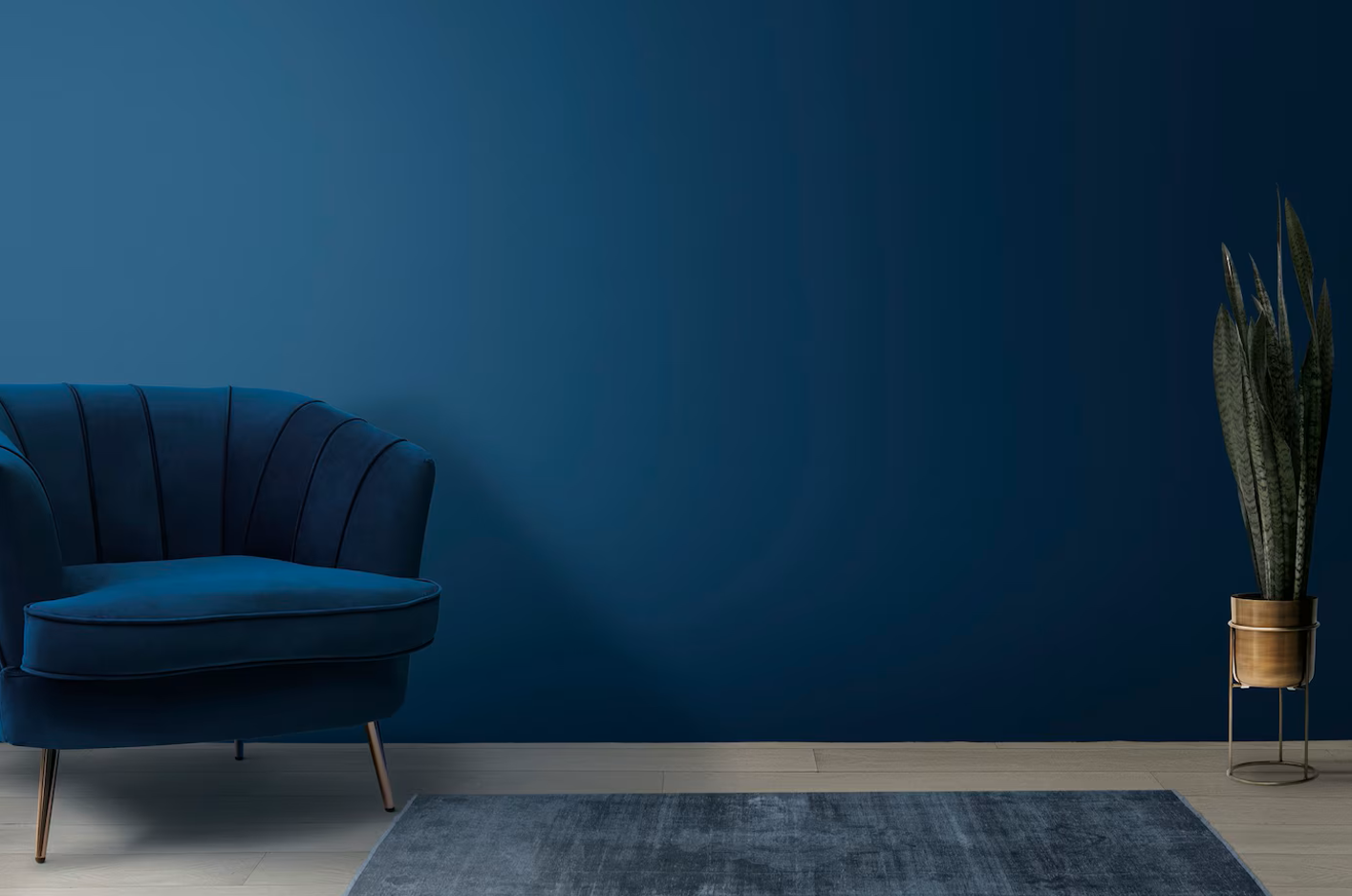
For instance, soft neutrals like whites, creams, and pastels reflect more light, giving the illusion of openness. On the other hand, deep tones like navy, charcoal, or forest green absorb light, making walls appear closer.
Use Light Colours for a Spacious Feel
One of the most effective strategies in Colour choices to enhance space is using light hues. Shades like off-white, pale grey, soft beige, and pastel blues or greens can make a room appear larger than it actually is.
Light colours:
- Reflect natural and artificial light
- Reduce visual boundaries
- Create a seamless and open look
For smaller rooms or apartments, sticking to a lighter colour palette is a simple yet powerful trick to maximize perceived space.
Monochromatic Colour Schemes
A monochromatic scheme involves using different shades, tones, and tints of a single colour. This approach minimizes contrast, allowing the eye to move smoothly across the room without interruption.
This is a smart technique in Colour choices to enhance space because it avoids visual clutter and creates a cohesive, expansive look. For example, pairing light grey walls with slightly darker grey furniture and soft silver accents can create depth without making the space feel cramped.
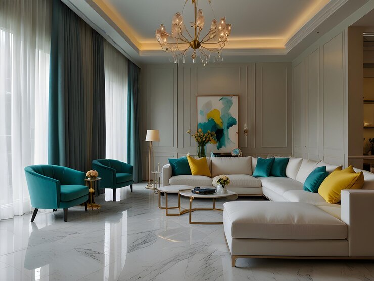
Strategic Use of Accent Colours
While light colours dominate when expanding space, accent colours add personality and depth. The key is moderation. Too many bold colours can break the visual flow and make a room feel smaller.
Instead:
- Use one or two accent colours
- Apply them through décor items like cushions, artwork, or rugs
- Keep walls neutral for balance
This approach ensures that your Colour choices to enhance space remain effective while still allowing creativity.
Vertical and Horizontal Colour Techniques
Colour can also be used to manipulate the perceived proportions of a room.
- Vertical stripes or lighter ceilings can make a room feel taller.
- Horizontal colour blocking can make a narrow room feel wider.
- Painting the ceiling a slightly lighter shade than the walls creates an illusion of height.
These techniques are essential when applying Colour choices to enhance space in compact or awkwardly shaped rooms.
The Power of Cool vs Warm Colours
Cool colours like blues, greens, and soft purples tend to recede visually, making them ideal for expanding space. Warm colours such as reds, oranges, and yellows advance visually, which can make walls feel closer.
For effective Colour choices to enhance space:
- Use cool tones for walls in smaller rooms
- Introduce warm tones through accessories to maintain warmth and comfort
This balance ensures that your space feels both open and inviting.
Reflective Surfaces and Finishes
Colour isn’t just about hue—it’s also about finish. Glossy or satin finishes reflect more light compared to matte finishes, helping to enhance brightness.
To optimize Colour choices to enhance space:
- Use semi-gloss or satin finishes on walls and trims
- Incorporate mirrors and metallic accents
- Choose light-coloured flooring with a slight sheen
These elements work together to amplify light and create a more spacious feel.
Consistency Across Spaces
Maintaining a consistent colour palette throughout connected areas can make a home feel larger. Abrupt colour changes can visually divide spaces, making them appear smaller.
Instead:
- Use a unified base colour
- Transition smoothly between shades
- Keep flooring and wall tones cohesive
Consistency is a key principle in Colour choices to enhance space, especially in open-plan layouts.
Natural Light and Colour Harmony
Natural light plays a crucial role in how colours appear. A shade that looks perfect in artificial lighting may feel different during the day.
To get the most out of your Colour choices to enhance space:
- Test paint samples in different lighting conditions
- Observe how colours change throughout the day
- Choose shades that complement your room’s natural light direction
This ensures your space remains visually appealing at all times.
Final Thoughts
Mastering Colour choices to enhance space is about more than just picking your favorite shades—it’s about understanding how colour interacts with light, structure, and perception. With the right approach, you can transform even the smallest or darkest room into a bright, open, and inviting space.
By using light colours, maintaining consistency, applying strategic accents, and considering finishes and lighting, you can unlock the full potential of your interiors without major renovations.